VELA

Vela is a mobile/web weather and sea forecast app used to provide wind, wave and weather reports for sailors, surfers, divers and any other water sport aficionado. 

Objective

Provide beautifully displayed and easy to understand wind, wave and weather reports and forecasts for sailors, surfers, divers and any other water sport aficionado. 

Problem statement

Our users need a way to check and easy understand wind, waves, weather reports, forecasts and statistics because that can help them avoid dangerous situations and better prepare for a day of sailing, diving or surfing.
We will know this to be true when we see how many water sport lovers are using our app to check weather conditions for their adventures.

Duration

July/19 - November/19

Purpose / Context

This project was part of my Immersive UX Design course with CareerFoundry.

For this project, I explored ways to take weather report app to the next level through research, analysis, and best practices in UX design. Some of the exciting puzzles that this app set out to solve include designing easy-to-comprehend data displays, figuring out ways to encourage users to get in the habit of checking the app before heading out to the water, and making the UI attractive.

The goal of this course demo project was to illustrate the UX design process from start to finish within the context of an app-building project.

My role

UX Design, UI Design, User Research

Understand

In the first stage of the Design thinking process I have engaged further into the issue to better understand the problem. I performed Competitive Analysis to understand the market in which I’m going to work. 

COMPETITIVE ANALYSIS

WINDY APP

Strengths

  • They have standard profiles that already have the set of parameters needed for special activity – for kitesurfing, fishing, surfing
  • Chat with locals and fellow visitors for a first-hand experience

Weaknesses

  • Overall poor UX execution and
    complex UI
  • User has to pay for Pro version
  • Doesn’t work without Wi-Fi
  • No instructions on how to use the app
  • Ads are very distractive

Opportunities

  • Design better interface and improve UX
  • Simplify information about wind, waves, tides and weather
  • Make Offline mode free of charge

Threats

  • Windy app has a long tradition and probably loyal users
  • Apps with a bigger budget invest more in marketing

COMPETITIVE ANALYSIS

WINDFINDER

Strengths

  • The wind and waves condition can be checked in real time
  • The app can be helpful for planning a vacation using detailed wind and weather statistics

Weaknesses

  • Ads are very distractive (sometimes they appear on half of the screen)
  • Overall poor UX execution and non intuitive UI (main colour is red)
  • User has to pay for a Pro version
  • No instructions on how to use the app

Opportunities

  • Add a screen where users can exchange experiences and tips with others
  • Design better interface and improve UX
  • Simplify information about wind, waves, tides and weather

Threats

  • Recently, Windfinder raised $150,000 from Sberbank
  • Apps with a bigger budget invest more in marketing

Observe

The best way to understand what the users need is to observe how they use the product. To get the first-hand information about users’ goals and needs I performed User Research. By observing, I collected data from the users’ organic interactions with a product. This data is going to reflect the use of our product in the real world

USER RESEARCH

INSIGHTS

  • Most of the users check the app a day or an hour before the activity
  • A lot of users use more than one app for all information they need 
  • Offline mode is a “must” 
  • Users feel distracted by ads
  • The app needs to have an option to save favourite spots
  • Reports are not well displayed - users feel like they need an expert to read those metrics
  • Visually attractive and easy to understand interface would be very useful
  • The app needs to show current location of a user
  • They would like to have all features in one app 
  • They need an app that works in offline mode because they are mostly offshore
  • Some features that users mentioned on interviews would be useful
  • The idea of info/reviews/tips screen seems very attractive to them
  • They would feel more confident and safe if they had first-hand information from locals and other users 

POV (Point of view)

With all collected information from user research, I created a Proto Personas. This Personas will highlight users’ goals and behaviours. 

USER PERSONAS

GOALS/NEEDS

  • Wants to sail as much as possible
  • Would like to connect with other sailors and locals to get valuable information
  • Needs reliable app with all information included that works offline

MOTIVATIONS

  • His main motivation is to find a good balance between work, family and sailing
  • Thomas enjoys every second while sailing with his friends
  • Sailing increases his sense of freedom and speed
  • It’s a perfect antidote to the stress of the modern world

FRUSTRATIONS

  • Thomas gets frustrated when he has to check three different apps for all necessary information 
  • He wants to get notified about weather changeThomas is usually offshore for a few days and it’s very frustrating when the app doesn’t work offline
  • He wants to be able to save previous locations and find them again easily

EVERYDAY ACTIVITIES

  • Wakes up early
  • Leads a team of 5 architects
  • Attends 3/4 meeting per day
  • Picks his daughter up from school

GOALS/NEEDS

  • Wants to explore the world and discover hidden places for surfing
  • Needs an app with simple and easy to understand interface
  • Wants an app to check the weather quickly before surfing

MOTIVATIONS

  • Her main motivation is to enjoy surfing and relax
  • She wants to share her experiences with others
  • Wants to socialise and meet new friends in every part of the world

FRUSTRATIONS

  • She finds apps for weather and sea condition very complicated
  • Doesn’t understand presented data
  • Would feel more confident having first hand information from locals
  • Doesn’t like seeing enormous distractive ads in the app

EVERYDAY ACTIVITIES

  • Commutes to and from work (35 minutes each way)
  • Works in the office for 8 hours
  • Chats with other surfers on social networks
  • Goes out with the friends

Ideate

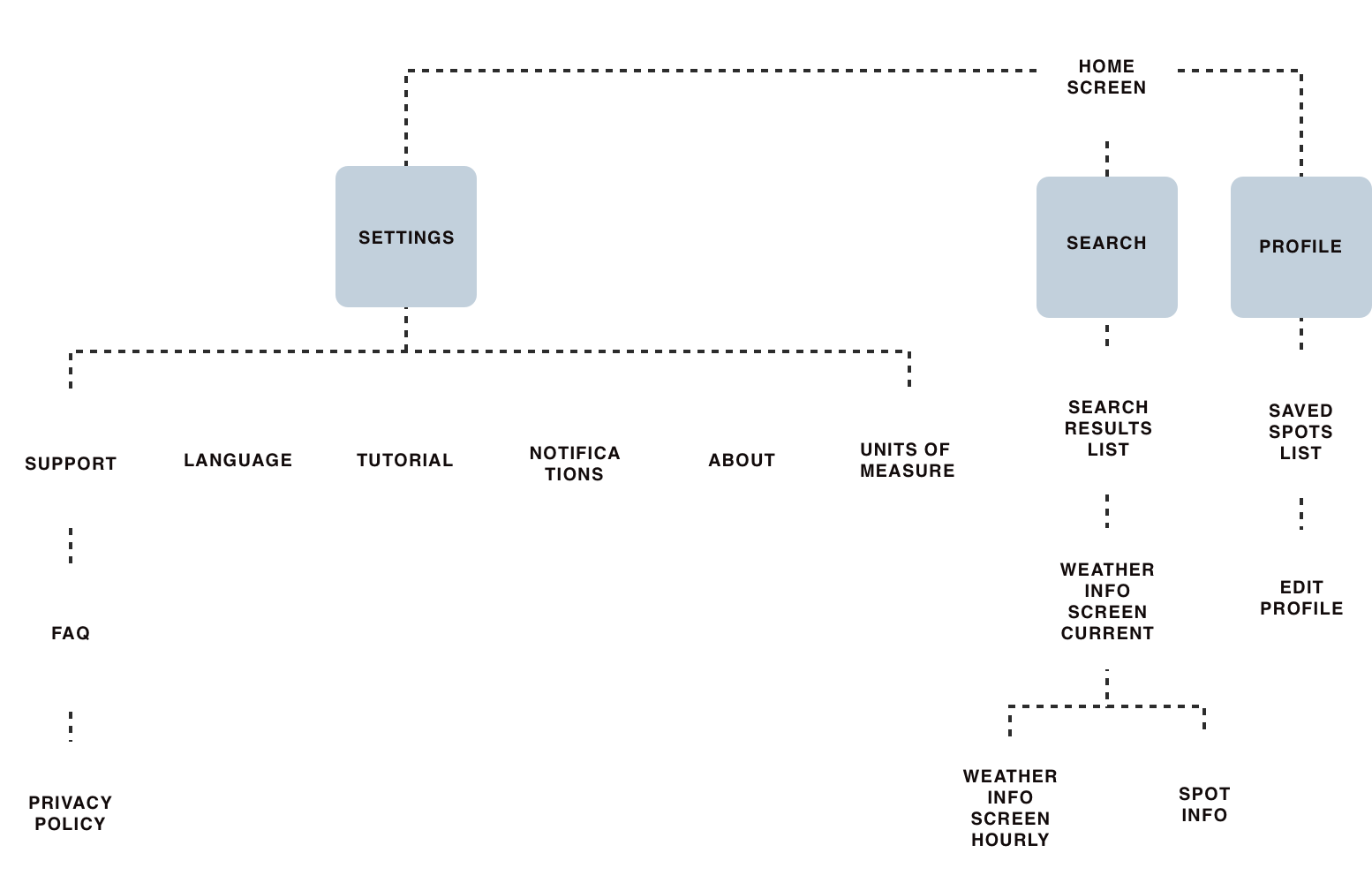
After understanding, observing and creating our Proto Persona, I started with drawing user flows and user journeys that led me to creating the structure - Information Architecture for my app.

USER FLOWS

USER JOURNEYS

INFORMATION ARCHITECTURE

Prototype

Once I’ve created and identified user flows and information architecture of my app, I began with transforming ideas into physical space - first on the paper and then in digital version. In this stage I created a bunch of low fidelity wireframes that will become first prototype of the app, ready for usability testing.

LOW FIDELITY WIREFRAMES

MID FIDELITY WIREFRAMES

HIGH FIDELITY WIREFRAMES

Test

I tested my prototype with real users. The aim of this testing was to collect feedback and first impressions from users. Usability testing provided me with useful information that helped me to improve my design. 

CONCLUSION

Aside from the registration issue, the majority of the problems were on the forecast screen. I didn’t think through all of that information before. In my updated prototype I added all necessary forecast info about weather, wind and water. Text description below icons should hopefully make it easier for users to navigate and understand forecast.

Final Design

Performing usability tests with three participants ended up with several key findings. I was able to make changes to the prototype. These are a few examples of what some final screens of the UI might look like.

Let's get in touch :)